Projects
When the <Virtual Environment> is started up a blank project is initialised and the “ModelIT” workspace is activated. To enter the Component Modeller click on the “CompLib” button in the “ModelBuilder” tab. This can be activated at any point in the creation/editing of the model. For more details of creating/opening/saving projects see the document General Help Topics section 3.
The viewport area may be white, with the grid in black, or in any other colour of the user’s choice.
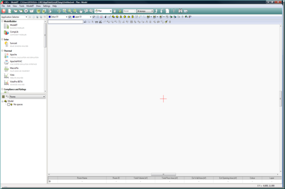
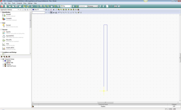
The Component Modeller Workspace
The sub-window you are now looking at is the Component Modeller workspace.
The workspace is divided as follows:
Pull-down Menu Bar
This provides an alternative method of accessing the functions available on the various toolbars.
Model Toolbar
This contains functions mainly associated with creating components.
Edit Toolbar
This contains functions mainly associated with editing components.
Viewport
The viewport window can also be used to show two or four viewports, see the ModelIT documentation for more information.
View Toolbar
This contains functions mainly associated with viewing models. For more information on this tool bar please refer to General help topics user guide section 2.3.4.
Object Bar
This contains information associated with the current object.
The “Object Bar” and toolbars can be switched on/off and the viewport options selected from the “View” pull-down menu. Please refer to ModelIT user guide section 2.4 for more information.
Levels of Decomposition
This works in a similar but more restricted way to what is available in ModelIT. Please refer to ModelIT user guide section 2.6 for more information.
Toolbars
The toolbars save you time by enabling you to select some of the most frequently used commands, without having to select them from the pull-down menus at the top of the ModelIT window. Each toolbar is described below from left to right.
Model Toolbar
Colour

Grid Settings

Grid Origin

Locks

Draw Arc

Draw Extruded Shape

Plane

Draw Prism

Draw Pyramid

Draw Sphere

Draw Hemisphere

Draw Cylinder

Component Handle

Component Viewer
Edit Toolbar
Key-in Field

Undo

Redo

Select Object

Measure Length

Measure Angle

Query Co-ordinates

Copy Selection Set

Move Selection Set

Scale Selection Set

Rotate Selection Set

Mirror Selection Set

Refresh Display

Delete
Object Bar
At the Component level the object bar displays details of the component that is selected:
The "Component Name" can be edited by double clicking on the field.
At the Body level the object bar displays details of the selected object:
The “Colour” can be edited by double clicking on the field.
At the Surface level the object bar displays adjacency details of the selected surface:
Component Browser
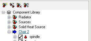
When the Component Modeller is entered for the first time a default component is created with no geometry as yet:
The four functions available are:

Create New Component

Copy Component

Remove Component

Add Component from Library
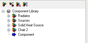
Create New Component
When this button is clicked a new component is created:
Note that this new component also has the default name “Component”, it is advisable to change this to a more meaningful name.
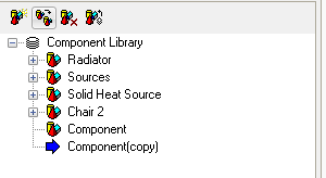
Copy Component
When this button is clicked a copy is made of the current component:
This is useful where minor variations of a component are required e.g. the same component with different colours applied. Again it is important to change the name of the component to fit its definition and avoid confusion.
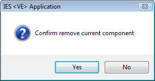
Remove Component
This will delete the current component from the library. A warning message is displayed:
Note that the last component cannot be deleted i.e. the library must contain at least one component.
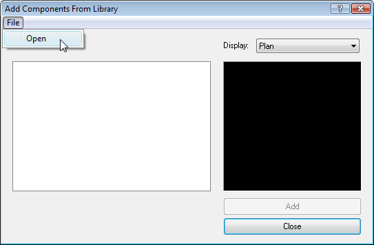
Add Component From Library
This is probably the most useful of the options. It allows the user to get an existing component from another model or from a standard library. The following window is popped-up:
By clicking the “File” button the user can browse to find an existing component library. Components can be selected and added to the current component library.
Components can be customised to the requirements of the current model, either by changing the geometry or by editing the colours.
Properties
If you right click a component in the Component Browser and select Properties you can change the name and Category of the component.
Standard means the component can be placed in ModelIt using the Place Component button.
CFD means the component can be used in CFD analysis.
Opening adds the component to the Add Opening dialog that is displayed in ModelIT when an opening is placed at model level.
The Component Modeller Tutorial details how to create an Opening Component for use in ModelIT.
