The Line plot is the basic visualisation for time series data. The following figure shows an example of a plot line for a 24-hour period.
Figure: Example of a line plot for .
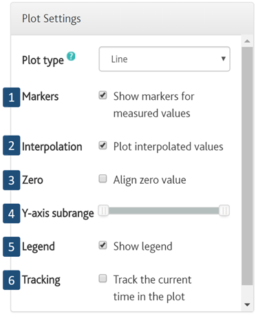
Figure 22: Line plot options.
Different options are available to customise the view of the line plots. These include:
1. Markers for measured values. Allowing to distinguish measured from interpolated data. Generally, markers are considered good practice when it comes to data visualisation.
2. Show interpolated values, calculated directly in iSCAN using interpolation if the data gap is no longer than 4 sample periods. For instance, if the sample period is 5 minutes, and data is not received in 25 minutes, data interpolation will not occur.
3. Aligning to zero value in the plot. Considered good practice for representing data relevant to energy, money, litres of water, etc. Other applications where relative difference between the values are more relevant than the absolute values, such as temperature measurements, do not require zero value alignment.
4. Y-axis subrange scaling. It allows to narrow down the Y-axis, allowing a “vertical zoom” effect. By default, the range of the Y-axis will be based on the highest or the lowest value in the whole time series, unless the option “Align zero value” is checked.
5. The show legend option enables the legend to be displayed in the plot.
6. Tracking. Shows an orange vertical line representing the current date and time in the plot.