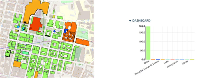
A visualise tool in iCD allows the end user to graphically overlay data over the 3D model. The dashboard displays the data graphically once all the desired options are selected and applied. Also, the building in the model get colour coded based on the colour range in the graph display on the dashboard.
Visualisation across a various spectrum of data types can be carried out with changes being made to the colour and range settings to suit the end users requirements.
Figure2-9: Visualization of building types and a dashboard showing the buildings type variation